.png)
Overview
As someone who’s always been fascinated by the relationship between space, emotion, and technology, I wanted to explore how smart home design could support mental and physical wellbeing. HomeSense is a passion project that reimagines the smart home as more than a convenience system it becomes a partner in creating balance, focus, and comfort throughout the day.HomeSense is a wellbeing-focused smart home app that harmonizes interior environments with emotional needs. It uses AI to analyze lighting, air quality, temperature, noise, and user behavior to create a personalized comfort experience that adapts to daily rhythms.
My role
Focus
UX Design, UI Design, AI Personalization, Wellness Design
Duration
November - December 2025 / 6 weeks
Project Type
Passion Project
Methods
Surveys, Comparative Audits, User Interviews, Personas, User Stories, Wireframing, Prototyping and Usability Testing
Design Toolkit
Pencil & Paper, Figma, Maze, Dovetail, Notion
Product Designer
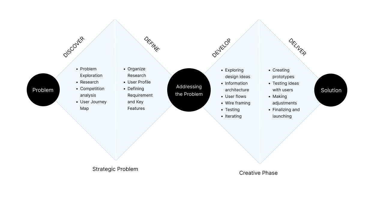
dESIGN PROCESS
How did I address the problem?
PROBLEM
Smart home products today are great at automation they adjust the temperature, dim lights, and play music but they rarely consider how users actually feel in their environments. Many people struggle with fatigue, poor sleep, or low focus at home due to subtle environmental factors like air quality, light exposure, or noise levels.
Opportunity
How might we design a smart home experience that nurtures comfort, calm, and focus through environmental awareness and gentle behavioral nudges?
DISCOVER
RESEARCH
To better understand the gap, I conducted:
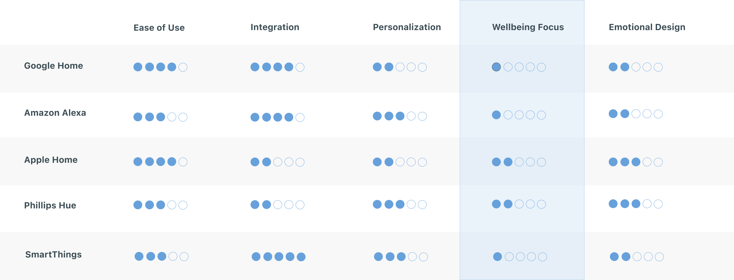
1. Competitive analysis of leading smart home systems (Google Home, Amazon Alexa, Philips Hue, Apple Home, SmartThings).
2. User interviews with remote workers and people living in small apartments.
1. Competitive analysis of leading smart home systems (Google Home, Amazon Alexa, Philips Hue, Apple Home, SmartThings).
2. User interviews with remote workers and people living in small apartments.
Comparative Analysis
Most smart home systems today prioritize control and convenience, not comfort and wellbeing. While platforms like SmartThings and Google Home excel at automation, they lack emotional intelligence leaving users to manage comfort on their own.
.png)
HomeSense reimagines what a smart home can be: A system that understands how your environment affects your mood, focus, and overall wellbeing and gently helps you feel your best at home.
Key Insights
1. People set up devices once but rarely adjust them again, automations feel complex or impersonal.
2. Comfort is tied to awareness and choice, not just automation.
3. Users want simple visual feedback that helps them feel in tune with their environment.
4. Subtle reminders are appreciated but only when they feel supportive, not demanding.
2. Comfort is tied to awareness and choice, not just automation.
3. Users want simple visual feedback that helps them feel in tune with their environment.
4. Subtle reminders are appreciated but only when they feel supportive, not demanding.
Target User
.png)
User Journey Map
.png)
DEFINE
DESIGN GOALS
1. Create a sense of awareness through simple, visual cues.
2. Support wellbeing through contextual recommendations (not intrusive alerts).
3. Design a calm, emotionally resonant interface inspired by natural patterns and light.
2. Support wellbeing through contextual recommendations (not intrusive alerts).
3. Design a calm, emotionally resonant interface inspired by natural patterns and light.
Key Features
1. AI-powered comfort predictions
2. Environmental dashboard with emotional insights
3. Personalized wellbeing modes
4. AI nudges for healthier habits
5. Daily wellbeing summaries
6. Predictive automations
7. Optional spatial awareness for device placement
8. Conversational voice controls
2. Environmental dashboard with emotional insights
3. Personalized wellbeing modes
4. AI nudges for healthier habits
5. Daily wellbeing summaries
6. Predictive automations
7. Optional spatial awareness for device placement
8. Conversational voice controls
DEVELOP
design
Key User Flows
This diagram shows exactly how the HomeSense AI thinks, detects discomfort, and decides whether to adjust the room or send a nudge.
.png)
design
Mood Board
I used a mood board to connect early sketches to mid-fidelity designs, aligning visuals with user needs and project goals. It guided the addition of realistic elements like content, buttons, and colors, keeping the designs clear, structured, and user-focused.
.png)
Style Guide
I created a style guide to ensure consistency, detailing typography, colors, and components. This streamlined the transition to high-fidelity designs while maintaining a cohesive user experience.
.png)
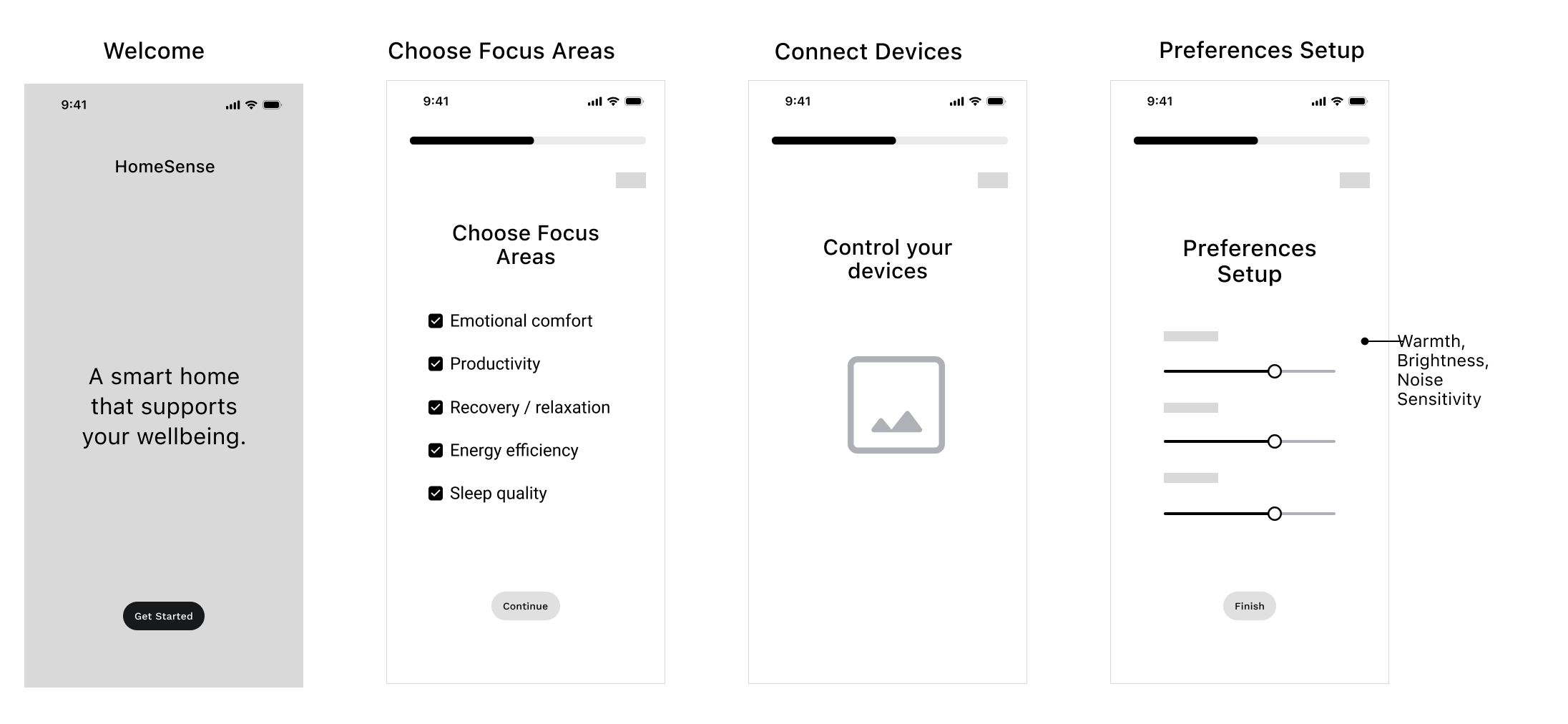
WIREFRAMES
I created wireframes to clarify the visual structure, which made the transition to mid-fidelity designs and user testing more seamless.
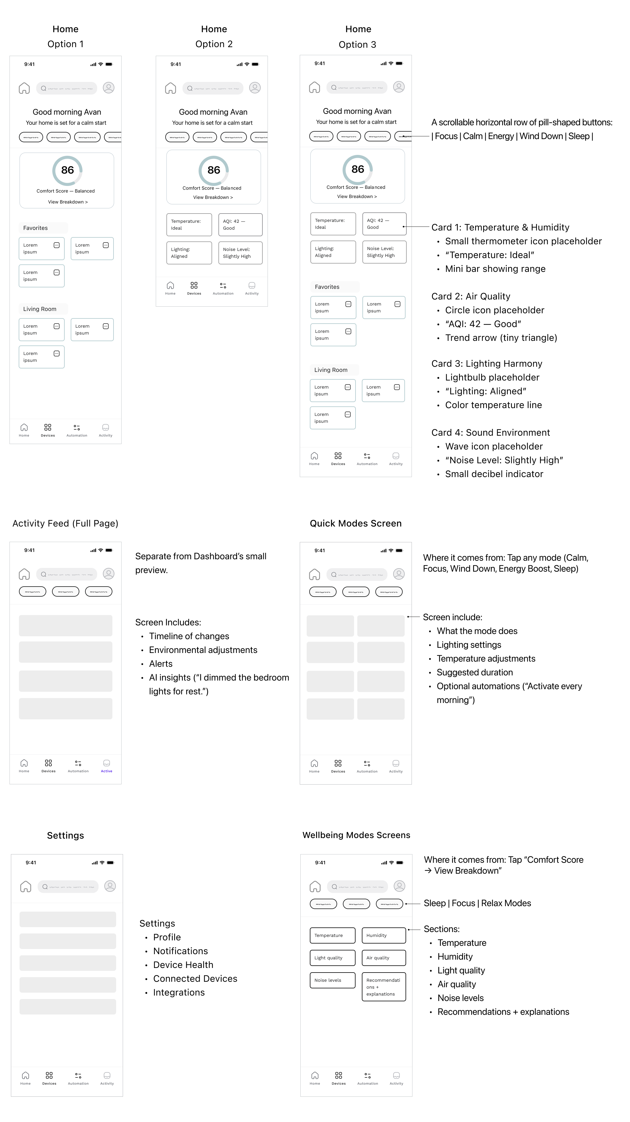
mid - fidelity designs
I transitioned the initial wireframes into mid-fidelity designs in Figma, adding clearer structure, content, buttons, and early color decisions. These updates were guided by user research and design feedback, ensuring the layouts were both practical and aligned with user needs. This stage created a solid foundation for the high-fidelity designs.
.png)
Deliver
HIGH FIDELITY Design
.png)
Reflection
Lesson Learned + What I'd do differently next time.
This project reinforced how important early user testing is for gathering meaningful insights that guide data-driven decisions. I also saw the impact of staying adaptable and iterating consistently, which helped strengthen the final solution.
More case studies

Grounded Clay Website
UI, UX, Website, Research

S&C Electric Company
UI, UX, App, Research, 2023 Summer Intership